Published on Nov 18, 2023 07:03
Flexbox Tutorial
Flexbox
- One-dimensional layout method for arranging items in rows or columns
- CSS layout model that makes it easier to design complex layouts in a more predictable way.
- It's especially useful for creating responsive and evenly distributed layouts.
In this tutorial, we'll start with the basics by discussing the Flex Container.
1. Flex Container:
- Parent
- an HTML element that contains one or more child elements (Flex Items) that can be flexibly arranged within it.
- Organizes child elements along a single axis (row or column).
- Enables easy alignment and distribution of space among items.
- Responsive design tool for building flexible and dynamic layouts.
- Facilitates efficient arrangement of items within a container.
To create a Flex Container, you need to apply the display: flex; or display: inline-flex; property to an HTML element.
Properties of flex container
- display flex
- flex-direction
- flex-wrap
- flex-flow
- justify-content
- align-items
Check below the definition and example
2. Flex Items:
- are the individual elements within a Flex Container.
- These items are arranged and aligned according to the properties set on the Flex Container.
- child elements of a Flex Container, and they inherit their parent container's layout behavior
Properties of flex items
- flex-grow
- flex-shrink
- flex-basis
- flex
- order
- align-self
- justify-self
Properties of a Flex Container:
- display: flex; or display: inline-flex; This is the fundamental property that turns an element into a Flex Container. The choice between flex and inline-flex depends on whether you want the container to behave like a block-level or inline-level element.
💡 Syntax: display: flex | inline-flex;
<!DOCTYPE html>
<html lang="en">
  <head>
    <meta charset="UTF-8" />
    <meta name="viewport" content="width=device-width, initial-scale=1.0" />
    <title>Document</title>
    <style>
      .flex-container-parent {
        display: flex; /*This is important*/
      }
      .flex-item-child {
        background-color: #66cc99; /*This is just for design*/
        color: black; /*This is just for design*/
        padding: 8px; /*This is just for design*/
				border: 1px solid #083d6d; /*This is just for design*/
        margin: 12px; /*This is just for design*/
      }
    </style>
  </head>
  <body>
    <div class="flex-container-parent">
      <div class="flex-item-child">Child 1</div>
      <div class="flex-item-child">Child 2</div>
      <div class="flex-item-child">Child 3</div>
      <div class="flex-item-child">Child 4</div>
      <div class="flex-item-child">Child 5</div>
      <div class="flex-item-child">Child 6</div>
    </div>
  </body>
</html>
Result

2. flex-direction: This property defines the primary axis along which the Flex Items are arranged.
💡 Syntax: flex-direction: row | row-reverse | column | column-reverse;
It can have one of the following values:
- row: Items are placed along the horizontal axis. (row is the default)
Only the styling will be shown below but it would be part of the html file above, which is also the first example:
   <style>
      .flex-container-parent {
        display: flex; /*This is important*/
        flex-direction: row;
      }
      .flex-item-child {
        background-color: #66cc99; /*This is just for design*/
        color: black; /*This is just for design*/
        padding: 8px; /*This is just for design*/
        border: 1px solid #083d6d; /*This is just for design*/
        margin: 12px; /*This is just for design*/
      }
    </style>
Result

- row-reverse: Items are placed along the horizontal axis in reverse order.
<style>
      .flex-container-parent {
        display: flex; /*This is important*/
        flex-direction: row-reverse;/*newly added*/
      }
      .flex-item-child {
        background-color: #66cc99; /*This is just for design*/
        color: black; /*This is just for design*/
        padding: 8px; /*This is just for design*/
        border: 1px solid #083d6d; /*This is just for design*/
        margin: 12px; /*This is just for design*/
      }
    </style>
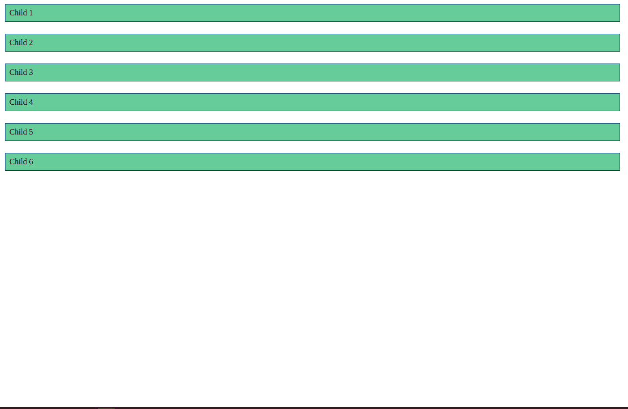
- column: Items are placed along the vertical axis.
   <style>
      .flex-container-parent {
        display: flex; /*This is important*/
        flex-direction: column;/*newly added*/
      }
      .flex-item-child {
        background-color: #66cc99; /*This is just for design*/
        color: black; /*This is just for design*/
        padding: 8px; /*This is just for design*/
        border: 1px solid #083d6d; /*This is just for design*/
        margin: 12px; /*This is just for design*/
      }
    </style>
Result:
- column-reverse: Items are placed along the vertical axis in reverse order.
  <style>
      .flex-container-parent {
        display: flex; /*This is important*/
        flex-direction: column-reverse;/*newly added*/
      }
      .flex-item-child {
        background-color: #66cc99; /*This is just for design*/
        color: black; /*This is just for design*/
        padding: 8px; /*This is just for design*/
        border: 1px solid #083d6d; /*This is just for design*/
        margin: 12px; /*This is just for design*/
      }
    </style>
Result

2. flex-wrap: This property determines how Flex Items wrap onto multiple lines if there's not enough space in the container.
💡 Syntax: flex-wrap: wrap | nowrap | wrap-reverse;
It can be:
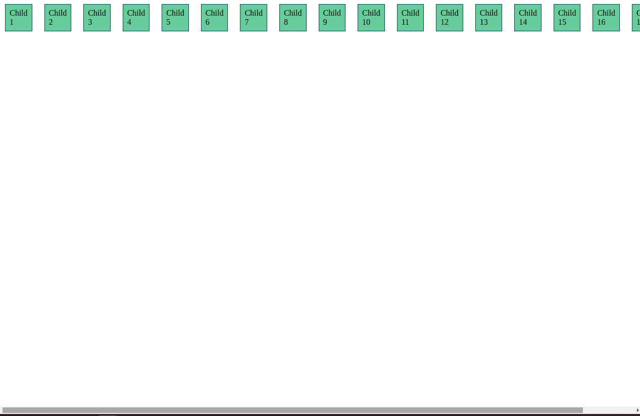
- nowrap (default): Items stay on a single line.
Added more child div to show nowrap
<!DOCTYPE html>
<html lang="en">
  <head>
    <meta charset="UTF-8" />
    <meta name="viewport" content="width=device-width, initial-scale=1.0" />
    <title>Document</title>
    <style>
      .flex-container-parent {
        display: flex; /*This is important*/
        flex-wrap: nowrap;/*newly added*/
      }
      .flex-item-child {
        background-color: #66cc99; /*This is just for design*/
        color: black; /*This is just for design*/
        padding: 8px; /*This is just for design*/
        border: 1px solid #083d6d; /*This is just for design*/
        margin: 12px; /*This is just for design*/
      }
    </style>
  </head>
  <body>
    <div class="flex-container-parent">
      <div class="flex-item-child">Child 1</div>
      <div class="flex-item-child">Child 2</div>
      <div class="flex-item-child">Child 3</div>
      <div class="flex-item-child">Child 4</div>
      <div class="flex-item-child">Child 5</div>
      <div class="flex-item-child">Child 6</div>
      <div class="flex-item-child">Child 7</div>
      <div class="flex-item-child">Child 8</div>
      <div class="flex-item-child">Child 9</div>
      <div class="flex-item-child">Child 10</div>
      <div class="flex-item-child">Child 11</div>
      <div class="flex-item-child">Child 12</div>
      <div class="flex-item-child">Child 13</div>
      <div class="flex-item-child">Child 14</div>
      <div class="flex-item-child">Child 15</div>
      <div class="flex-item-child">Child 16</div>
      <div class="flex-item-child">Child 17</div>
      <div class="flex-item-child">Child 18</div>
    </div>
  </body>
</html>
- wrap: Items wrap onto multiple lines as necessary.
   <style>
      .flex-container-parent {
        display: flex; /*This is important*/
        flex-wrap: wrap;/*newly added*/
      }
      .flex-item-child {
        background-color: #66cc99; /*This is just for design*/
        color: black; /*This is just for design*/
        padding: 8px; /*This is just for design*/
        border: 1px solid #083d6d; /*This is just for design*/
        margin: 12px; /*This is just for design*/
      }
    </style>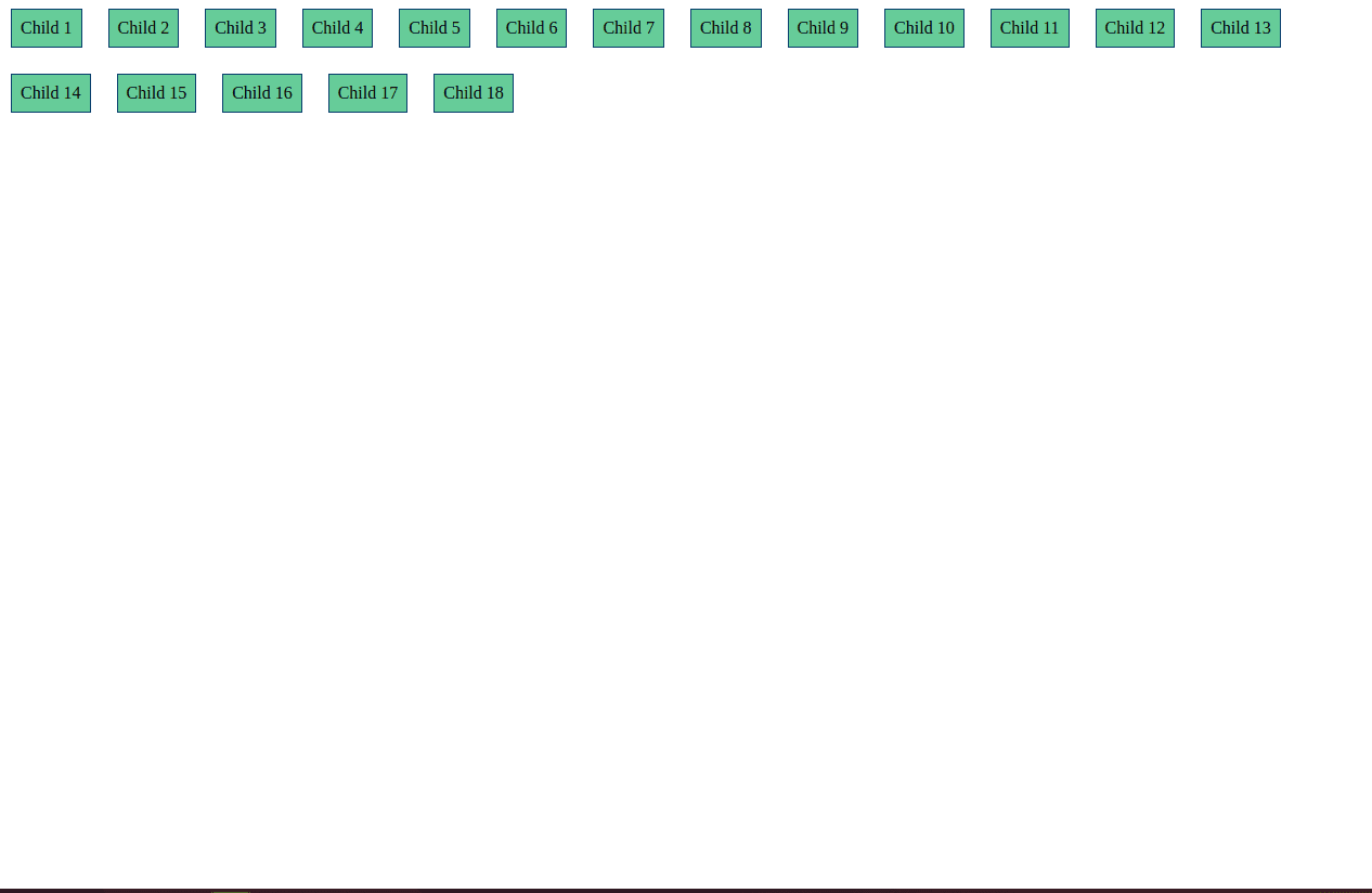
- wrap-reverse: Items wrap onto multiple lines in reverse order.
  <style>
      .flex-container-parent {
        display: flex; /*This is important*/
        flex-wrap: wrap-reverse;/*newly added*/
      }
      .flex-item-child {
        background-color: #66cc99; /*This is just for design*/
        color: black; /*This is just for design*/
        padding: 8px; /*This is just for design*/
        border: 1px solid #083d6d; /*This is just for design*/
        margin: 12px; /*This is just for design*/
      }
    </style>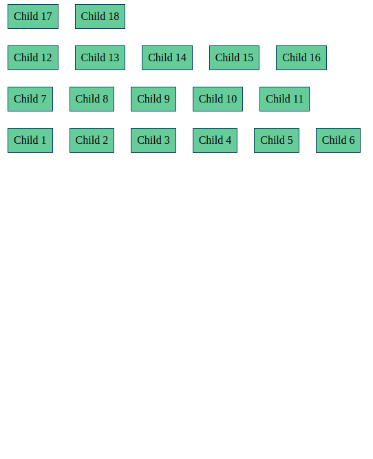
4. flex-flow (shorthand for flex-direction and flex-wrap)
    <style>
      .flex-container-parent {
        display: flex; /*This is important*/
        flex-flow: row wrap;/*newly added*/
      }
      .flex-item-child {
        background-color: #66cc99; /*This is just for design*/
        color: black; /*This is just for design*/
        padding: 8px; /*This is just for design*/
        border: 1px solid #083d6d; /*This is just for design*/
        margin: 12px; /*This is just for design*/
      }
    </style>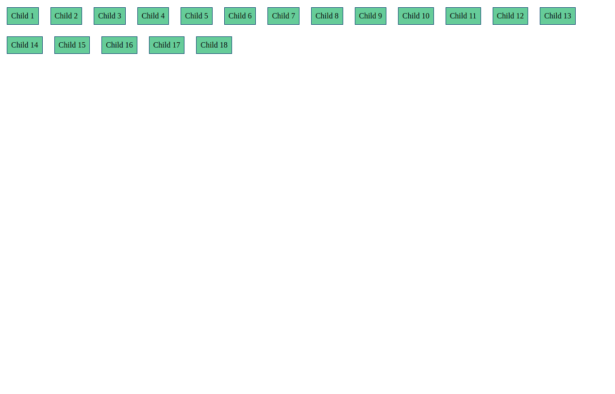
5. justify-content: This property controls the alignment of Flex Items along the main axis.
💡 Syntax: justify-content: flex-start | flex-end | center | space-between | space-around | space-evenly;
It can have values like:
- flex-start: Items are aligned to the start of the container, meaning they are positioned at the beginning of the main axis.
<!DOCTYPE html>
<html lang="en">
  <head>
    <meta charset="UTF-8" />
    <meta name="viewport" content="width=device-width, initial-scale=1.0" />
    <title>Document</title>
    <style>
      .flex-container-parent {
        display: flex; /*This is important*/
        flex-direction: row;
        justify-content: flex-start;
      }
      .flex-item-child {
        background-color: #66cc99; /*This is just for design*/
        color: black; /*This is just for design*/
        padding: 8px; /*This is just for design*/
		border: 1px solid #083d6d; /*This is just for design*/
        margin: 12px; /*This is just for design*/
      }
    </style>
  </head>
  <body>
    <div class="flex-container-parent">
      <div class="flex-item-child">Child 1</div>
      <div class="flex-item-child">Child 2</div>
      <div class="flex-item-child">Child 3</div>
      <div class="flex-item-child">Child 4</div>
      <div class="flex-item-child">Child 5</div>
      <div class="flex-item-child">Child 6</div>
    </div>
  </body>
</html>
- flex-end: Items are aligned to the end of the container, indicating that they are positioned at the conclusion of the main axis.
<!DOCTYPE html>
<html lang="en">
  <head>
    <meta charset="UTF-8" />
    <meta name="viewport" content="width=device-width, initial-scale=1.0" />
    <title>Document</title>
    <style>
      .flex-container-parent {
        display: flex; /*This is important*/
        flex-direction: row;
        justify-content: flex-end;
      }
      .flex-item-child {
        background-color: #66cc99; /*This is just for design*/
        color: black; /*This is just for design*/
        padding: 8px; /*This is just for design*/
		border: 1px solid #083d6d; /*This is just for design*/
        margin: 12px; /*This is just for design*/
      }
    </style>
  </head>
  <body>
    <div class="flex-container-parent">
      <div class="flex-item-child">Child 1</div>
      <div class="flex-item-child">Child 2</div>
      <div class="flex-item-child">Child 3</div>
      <div class="flex-item-child">Child 4</div>
      <div class="flex-item-child">Child 5</div>
      <div class="flex-item-child">Child 6</div>
    </div>
  </body>
</html>
- center: Items are centered within the container along the main axis, ensuring an equal amount of space on both sides.
<!DOCTYPE html>
<html lang="en">
  <head>
    <meta charset="UTF-8" />
    <meta name="viewport" content="width=device-width, initial-scale=1.0" />
    <title>Document</title>
    <style>
      .flex-container-parent {
        display: flex; /*This is important*/
        flex-direction: row;
        justify-content: center;
      }
      .flex-item-child {
        background-color: #66cc99; /*This is just for design*/
        color: black; /*This is just for design*/
        padding: 8px; /*This is just for design*/
		border: 1px solid #083d6d; /*This is just for design*/
        margin: 12px; /*This is just for design*/
      }
    </style>
  </head>
  <body>
    <div class="flex-container-parent">
      <div class="flex-item-child">Child 1</div>
      <div class="flex-item-child">Child 2</div>
      <div class="flex-item-child">Child 3</div>
      <div class="flex-item-child">Child 4</div>
      <div class="flex-item-child">Child 5</div>
      <div class="flex-item-child">Child 6</div>
    </div>
  </body>
</html>
- space-between: Items are evenly distributed along the main axis with equal space between them, ensuring the first and last items touch the container's start and end, respectively.
<!DOCTYPE html>
<html lang="en">
  <head>
    <meta charset="UTF-8" />
    <meta name="viewport" content="width=device-width, initial-scale=1.0" />
    <title>Document</title>
    <style>
      .flex-container-parent {
        display: flex; /*This is important*/
        flex-direction: row;
        justify-content: space-between;
      }
      .flex-item-child {
        background-color: #66cc99; /*This is just for design*/
        color: black; /*This is just for design*/
        padding: 8px; /*This is just for design*/
		border: 1px solid #083d6d; /*This is just for design*/
        margin: 12px; /*This is just for design*/
      }
    </style>
  </head>
  <body>
    <div class="flex-container-parent">
      <div class="flex-item-child">Child 1</div>
      <div class="flex-item-child">Child 2</div>
      <div class="flex-item-child">Child 3</div>
      <div class="flex-item-child">Child 4</div>
      <div class="flex-item-child">Child 5</div>
      <div class="flex-item-child">Child 6</div>
    </div>
  </body>
</html>
- space-around: Items are evenly distributed along the main axis with equal space around them, providing equal spacing on all sides of each item, including the space before the first item and after the last item.
<!DOCTYPE html>
<html lang="en">
  <head>
    <meta charset="UTF-8" />
    <meta name="viewport" content="width=device-width, initial-scale=1.0" />
    <title>Document</title>
    <style>
      .flex-container-parent {
        display: flex; /*This is important*/
        flex-direction: row;
        justify-content: space-around;
      }
      .flex-item-child {
        background-color: #66cc99; /*This is just for design*/
        color: black; /*This is just for design*/
        padding: 8px; /*This is just for design*/
		border: 1px solid #083d6d; /*This is just for design*/
        margin: 12px; /*This is just for design*/
      }
    </style>
  </head>
  <body>
    <div class="flex-container-parent">
      <div class="flex-item-child">Child 1</div>
      <div class="flex-item-child">Child 2</div>
      <div class="flex-item-child">Child 3</div>
      <div class="flex-item-child">Child 4</div>
      <div class="flex-item-child">Child 5</div>
      <div class="flex-item-child">Child 6</div>
    </div>
  </body>
</html>
- space-evenly: Items are evenly distributed along the main axis with equal space around them, ensuring both the space between items and the space before the first and after the last items are the same. This means that the total space is divided equally, creating a uniform distribution with equal spacing at every point along the main axis.
<!DOCTYPE html>
<html lang="en">
  <head>
    <meta charset="UTF-8" />
    <meta name="viewport" content="width=device-width, initial-scale=1.0" />
    <title>Document</title>
    <style>
      .flex-container-parent {
        display: flex; /*This is important*/
        flex-direction: row;
        justify-content: space-evenly;
      }
      .flex-item-child {
        background-color: #66cc99; /*This is just for design*/
        color: black; /*This is just for design*/
        padding: 8px; /*This is just for design*/
		border: 1px solid #083d6d; /*This is just for design*/
        margin: 12px; /*This is just for design*/
      }
    </style>
  </head>
  <body>
    <div class="flex-container-parent">
      <div class="flex-item-child">Child 1</div>
      <div class="flex-item-child">Child 2</div>
      <div class="flex-item-child">Child 3</div>
      <div class="flex-item-child">Child 4</div>
      <div class="flex-item-child">Child 5</div>
      <div class="flex-item-child">Child 6</div>
    </div>
  </body>
</html>
6.align-items: This property controls the alignment of Flex Items along the cross-axis.
💡 Syntax: align-items: flex-start | flex-end | center | baseline | stretch;
It can have values like:
- flex-start: Aligns items to the start of the cross-axis, ensuring they are positioned at the beginning.
<!DOCTYPE html>
<html lang="en">
  <head>
    <meta charset="UTF-8" />
    <meta name="viewport" content="width=device-width, initial-scale=1.0" />
    <title>Document</title>
    <style>
      .flex-container-parent {
        display: flex; /*This is important*/
        flex-direction: row;
        border:1px solid red; /*This is just for design*/
        height: 150px; /*This is just for design*/
        align-items: flex-start;
      }
      .flex-item-child {
        background-color: #66cc99; /*This is just for design*/
        color: black; /*This is just for design*/
        padding: 8px; /*This is just for design*/
		border: 1px solid #083d6d; /*This is just for design*/
        margin: 12px; /*This is just for design*/
      }
    </style>
  </head>
  <body>
    <div class="flex-container-parent">
      <div class="flex-item-child">Child 1</div>
      <div class="flex-item-child">Child 2</div>
      <div class="flex-item-child">Child 3</div>
      <div class="flex-item-child">Child 4</div>
      <div class="flex-item-child">Child 5</div>
      <div class="flex-item-child">Child 6</div>
    </div>
  </body>
</html>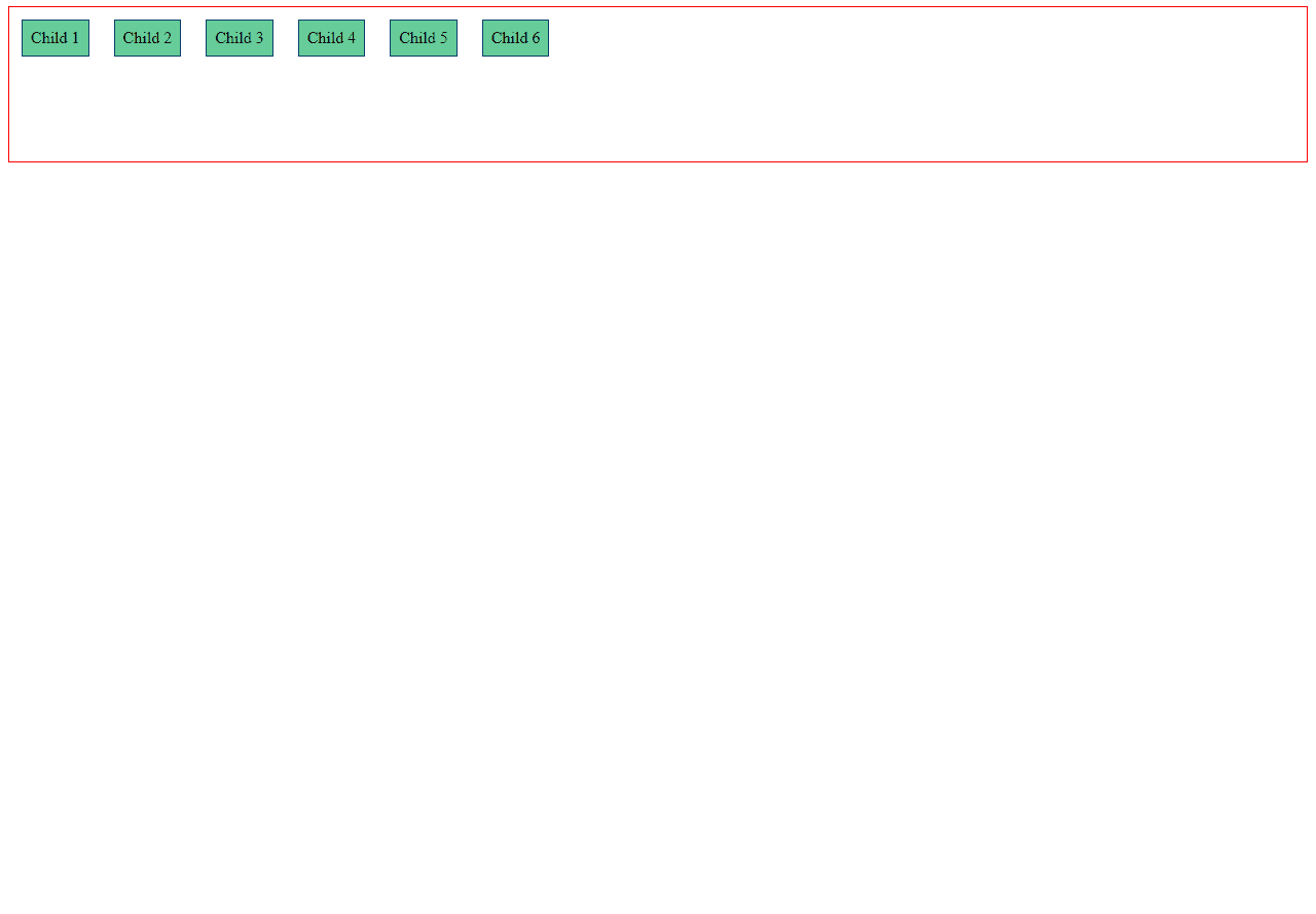
- flex-end: Aligns items to the end of the cross-axis, placing them at the conclusion.
<!DOCTYPE html>
<html lang="en">
  <head>
    <meta charset="UTF-8" />
    <meta name="viewport" content="width=device-width, initial-scale=1.0" />
    <title>Document</title>
    <style>
      .flex-container-parent {
        display: flex; /*This is important*/
        flex-direction: row;
        border:1px solid red; /*This is just for design*/
        height: 150px; /*This is just for design*/
        align-items: flex-end;
      }
      .flex-item-child {
        background-color: #66cc99; /*This is just for design*/
        color: black; /*This is just for design*/
        padding: 8px; /*This is just for design*/
		border: 1px solid #083d6d; /*This is just for design*/
        margin: 12px; /*This is just for design*/
      }
    </style>
  </head>
  <body>
    <div class="flex-container-parent">
      <div class="flex-item-child">Child 1</div>
      <div class="flex-item-child">Child 2</div>
      <div class="flex-item-child">Child 3</div>
      <div class="flex-item-child">Child 4</div>
      <div class="flex-item-child">Child 5</div>
      <div class="flex-item-child">Child 6</div>
    </div>
  </body>
</html>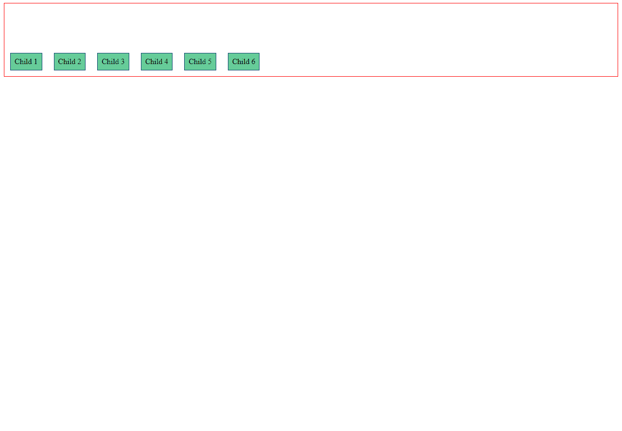
- center: Centers items along the cross-axis, creating a balanced distribution.
<!DOCTYPE html>
<html lang="en">
  <head>
    <meta charset="UTF-8" />
    <meta name="viewport" content="width=device-width, initial-scale=1.0" />
    <title>Document</title>
    <style>
      .flex-container-parent {
        display: flex; /*This is important*/
        flex-direction: row;
        border:1px solid red; /*This is just for design*/
        height: 150px; /*This is just for design*/
        align-items: center;
      }
      .flex-item-child {
        background-color: #66cc99; /*This is just for design*/
        color: black; /*This is just for design*/
        padding: 8px; /*This is just for design*/
		border: 1px solid #083d6d; /*This is just for design*/
        margin: 12px; /*This is just for design*/
      }
    </style>
  </head>
  <body>
    <div class="flex-container-parent">
      <div class="flex-item-child">Child 1</div>
      <div class="flex-item-child">Child 2</div>
      <div class="flex-item-child">Child 3</div>
      <div class="flex-item-child">Child 4</div>
      <div class="flex-item-child">Child 5</div>
      <div class="flex-item-child">Child 6</div>
    </div>
  </body>
</html>
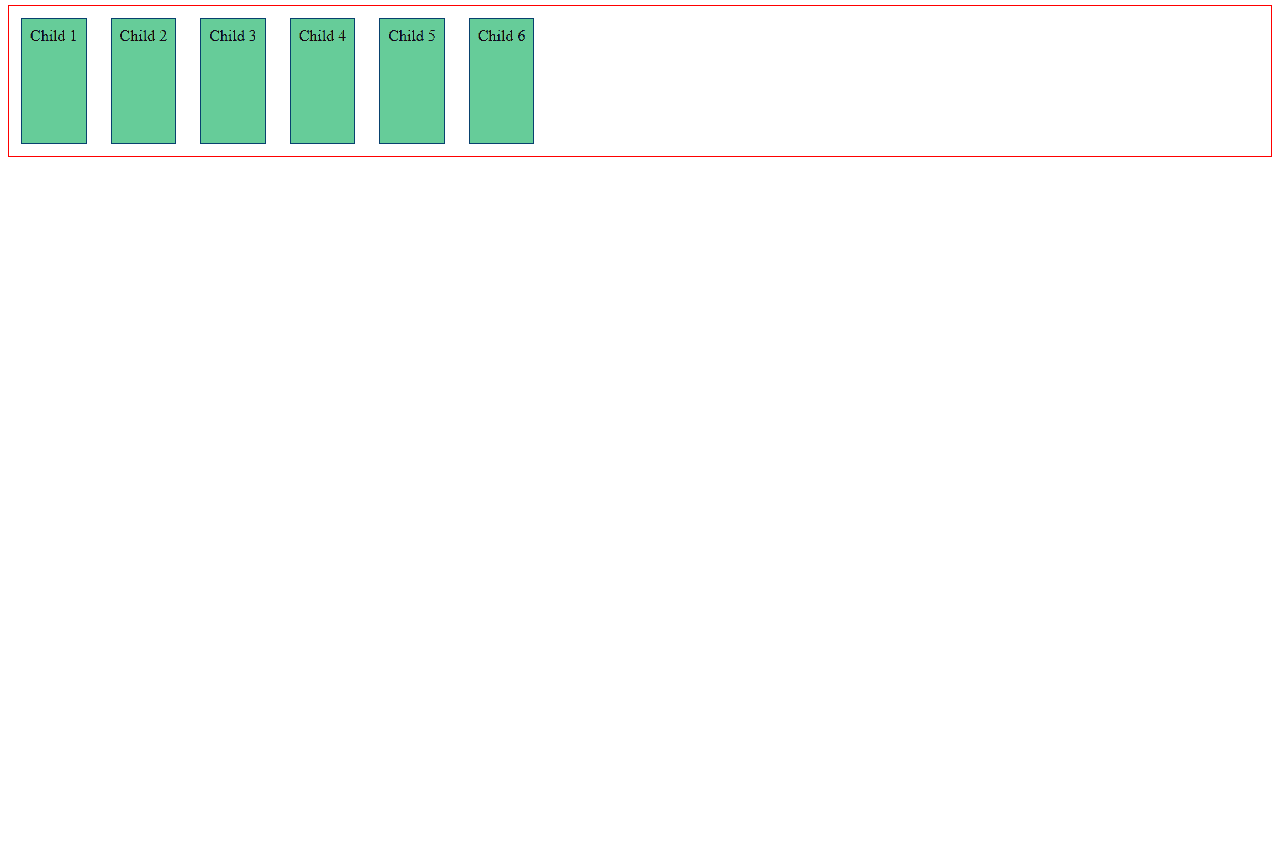
- baseline: Aligns items to their baselines, useful when items have varying content heights, aligning them based on the baseline of their text.
<!DOCTYPE html>
<html lang="en">
  <head>
    <meta charset="UTF-8" />
    <meta name="viewport" content="width=device-width, initial-scale=1.0" />
    <title>Document</title>
    <style>
      .flex-container-parent {
        display: flex; /*This is important*/
        flex-direction: row;
        border:1px solid red; /*This is just for design*/
        height: 150px; /*This is just for design*/
        align-items: baseline;
      }
      .flex-item-child {
        background-color: #66cc99; /*This is just for design*/
        color: black; /*This is just for design*/
        padding: 8px; /*This is just for design*/
		border: 1px solid #083d6d; /*This is just for design*/
        margin: 12px; /*This is just for design*/
      }
       /* Added different font sizes for demonstration */
        .child1 {
            font-size: 20px;
        }
        .child2 {
            font-size: 16px;
        }
        .child3 {
            font-size: 24px;
        }
        .child4 {
            font-size: 18px;
        }
        .child5 {
            font-size: 22px;
        }
        .child6 {
            font-size: 14px;
        }
    </style>
  </head>
  <body>
    <div class="flex-container-parent">
      <div class="flex-item-child child1">Child 1</div>
      <div class="flex-item-child child2">Child 2</div>
      <div class="flex-item-child child3">Child 3</div>
      <div class="flex-item-child child4">Child 4</div>
      <div class="flex-item-child child5">Child 5</div>
      <div class="flex-item-child child6">Child 6</div>
    </div>
  </body>
</html>
This is the result of align-items: baseline it was quite the same with align-items: flex-start
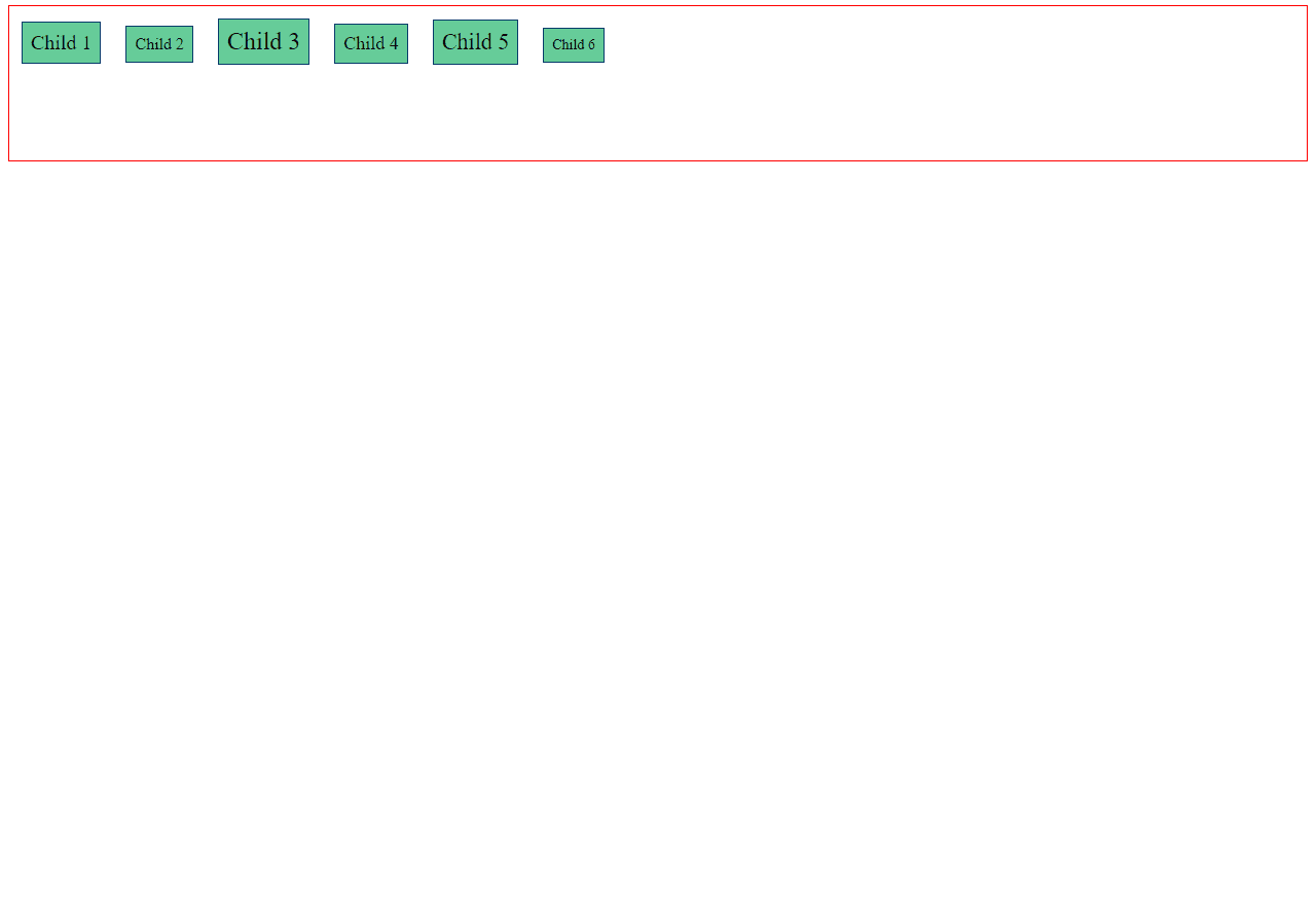
This is the result in using align-items:flex-start, see the difference

- stretch (default): Stretches items to fill the container along the cross-axis, ensuring they occupy the entire available space.
<!DOCTYPE html>
<html lang="en">
  <head>
    <meta charset="UTF-8" />
    <meta name="viewport" content="width=device-width, initial-scale=1.0" />
    <title>Document</title>
    <style>
      .flex-container-parent {
        display: flex; /*This is important*/
        flex-direction: row;
        border:1px solid red; /*This is just for design*/
        height: 150px; /*This is just for design*/
        flex-wrap:wrap;
        align-items: stretch;
      }
      .flex-item-child {
        background-color: #66cc99; /*This is just for design*/
        color: black; /*This is just for design*/
        padding: 8px; /*This is just for design*/
		border: 1px solid #083d6d; /*This is just for design*/
        margin: 12px; /*This is just for design*/
      }

    </style>
  </head>
  <body>
    <div class="flex-container-parent">
      <div class="flex-item-child">Child 1</div>
      <div class="flex-item-child">Child 2</div>
      <div class="flex-item-child">Child 3</div>
      <div class="flex-item-child">Child 4</div>
      <div class="flex-item-child">Child 5</div>
      <div class="flex-item-child">Child 6</div>
    </div>
  </body>
</html>